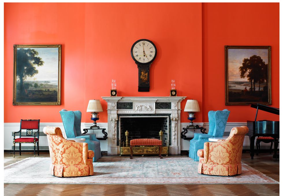
No matter how much you prepare for your first visit to The Greenbrier, you’ll still be appropriately humbled by the grandeur of design within this historic resort. There’s nary an inch that hasn’t been touched by the gracious designs of famed American design icon Dorothy Draper and her protégé, Carleton Varney. While both revered design pioneers are no longer with us, their mark lives on in the sumptuous florals and patterns that fill every hotel room, salon, bar, restaurant and gathering space. So, it seems only fitting that the resort dedicates an entire weekend to celebrating the legacy of these designers with the annual Dorothy Draper Design Weekend held each March.
Leading this year’s event was Dorothy Draper & Company President (and Carleton’s son) Sebastian Varney and Design Director Rudy Saunders. In between tours of the resort’s upholstery shop, a floral arranging class, team-led lectures, workshops, receptions and dinners, there was still time to become immersed in the maximalist style that Dorothy Draper, the so-called Duchess of Decorating, epitomized. I came away from this glorious long weekend teeming with inspiration and a renewed perspective on using bold patterns and color in home décor. Here are a few tips and tricks I learned.
Don’t Take Design Too Seriously
“Decorating is fun” was Dorothy’s famous tagline and the title of her first book on the subject, first published in 1939. It is a simple reminder that we need not overthink the process of developing the style of a specific space. It is meant to be enjoyed and delighted in, savored and relished. Saunders echoes this sentiment, “This is one of the goals I want attendees to come away with—they can break out of their comfort zone, go home and add in a colorful throw pillow or two, repaint a room with a bright color.”
Furthermore, good design shouldn’t feel stuffy—your beautiful pieces should be made for everyday living. “Throw the dinner party, pull out the good china for casual pizza night – live your life and enjoy. That feeling is accessible to all,” says Saunders.
Don’t Be Afraid to Really Mix Contrasting Patterns
Play with the palette that speaks to you and the way you wish to enjoy a space. In the Saturday workshop, Design Director Rudy Saunders and Interior Design Project Manager Merriweather Franklin used their cache of swatches and trims to create multi-layered inspirational vignettes, based upon attendees’ requests. Sumptuous drapes backed with a coordinating fabric that then reappears on upholstered dining room chairs; floral wallpaper that plays off a boldly painted ceiling. In the primary bedroom, valances featuring outsized sweeping designs which are grounded in a tighter pattern in the bedskirt. Accent pillows and an accompanying chaise lounge can feature a more masculine plaid with substantial trim.
Mostly, though, you should make it personal to you. “Residential design is so different from that of a commercial space; we’re incorporating more of the client’s individual tastes and existing furniture. We take the fundamental design ideals of the Draper aesthetic and bring that into their space, in a way that feels right. That’s what makes the residential projects so challenging and interesting,” says Saunders.
Whimsy and Symmetry Play Well Together
Something I noticed across the entirety of the resort property (our coterie privately toured all the fantastic suites, and several cottages on site) was the amount of symmetry at play in rooms simultaneously filled with fun florals and happy plaids. While the fabrics and wall coverings are playful, light and joyous, they are balanced by the intentional placement of everything from furniture to doors and window. One grounds the other. The structure of the room lets the pattern have all the fun.
Saunders says, “For it being over the top, it is actually pared back and streamlined with that symmetry and order. There might be a single painting on a wall as opposed to a gallery wall. And in the large upper lobby that Mrs. Draper did in the 1940’s, the shape of the window treatments is the same as today, which she did in a solid. Mr. Varney updated them in the same shape but with a different fabric which layered in another element. The lines are still pulled back and tailored but with some splash added.”
It’s Okay to Start Small
My personal design aesthetic leans more to the subdued than maximalist so it took me a moment to consider how I might incorporate these fantastic Dorothy Draper Designs into my own home. But touring the upholstery shop (a special treat for event attendees only), I found myself drawn to one particular pattern over another, the tobacco leaf. I knew immediately that as linens or accent pillows, this would be a welcome addition to my home’s palette. Perhaps I am not bold enough to go floor-to-ceiling, stem-to-stern in florals, but welcoming a few key pieces into my house has helped me channel that Dorothy Draper infectious embrace of color.
Of course, those wishing to bring that entire Greenbrier feeling home can engage the services of Rudy Saunders to reimagine whole rooms and homes in that maximalist style. He and Sebastian Varney regularly work on homes coast to coast, bringing the Dorothy Draper joie de vivre.
“We have a lot of people who find us through their experience visiting The Greenbrier and they want to bring that feeling home,” says Saunders.
“If It Looks Right, It Is Right”
This is another Dorothy Draper truism that I embrace wholeheartedly. Decorating a home of my own, I fill it with décor, finds, treasures and color that make me happy. My collection of birds’ nests and tortoise shells line a library shelf. Pheasant feathers find their way into all holiday decorations. Hermès orange is a foundational color in my home. I am less drawn to trends than the sense of place I feel when I walk though my front door. I think Mrs. Draper would approve.


