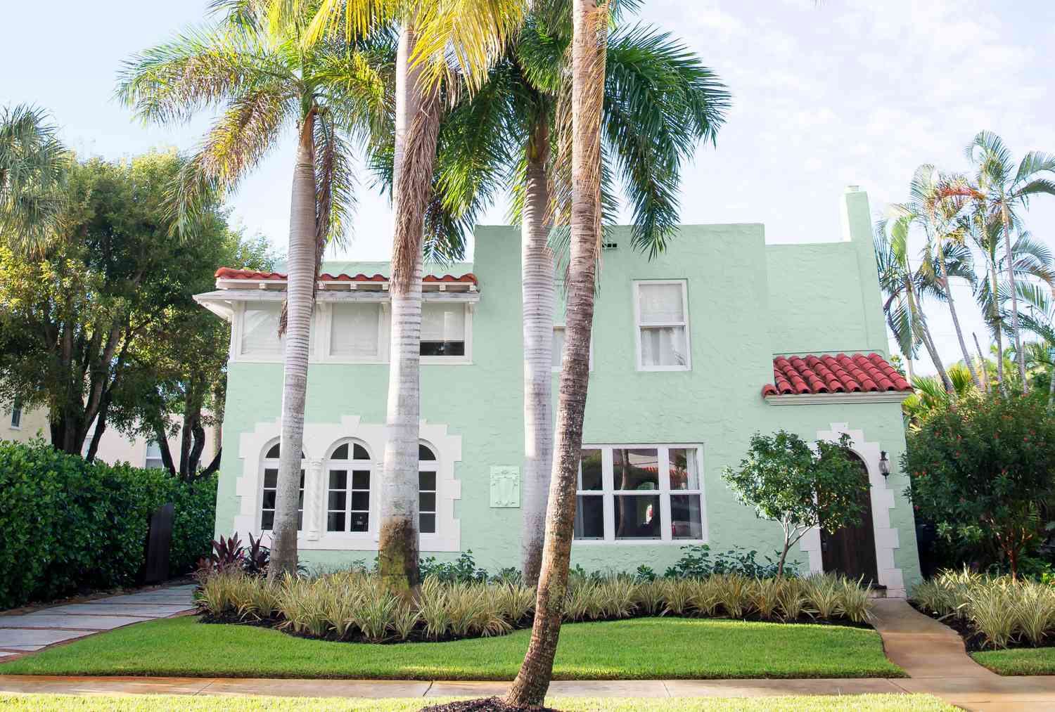
For homeowner Korinne Belock, finding a 1920s Spanish-style gem in West Palm Beach, Florida’s historic El Cid neighborhood was a happy accident. Since relocating from New York City two years prior, she and her husband, D.J., had been living in a rental property. Right after they’d decided to buy their first home together, she noticed an open house sign two doors down from a friend’s place. “Not realizing the event was only for Realtors, I walked in and immediately felt and saw what the place could be,” she says. “Everything about the flow and the size was exactly what I had envisioned.”
She knew just how to furnish it too. While living in their rental, the transplants had discovered Palm Beach Regency, a vintage furniture-and-decor store that unleashed their love of all things rattan, Chippendale, and shell covered. Belock was sure these pieces would feel at ease within the century-old walls. “I knew I wanted a home that matched that aesthetic,” she says. The main house had been left largely untouched, retaining its historic footprint. “It’s not for everyone because there are a lot of small, contained spaces,” Belock notes. “But with so many windows, there is plenty of natural light. It’s a funky layout with a lot of character.” On the other hand, she says the home’s aluminum-sided addition “had to go” in favor of a new guesthouse for entertaining that doubles as a poolside cabana.
To help define their style and determine how each area should function, the Belocks called on Jennaea Denhardt, a designer they’ve collaborated with often over the years. “They’ve always had an island vibe no matter where they’ve lived, and this house really gave us the freedom to go all in with who they are,” says Denhardt. That “all in” approach extended beyond their abode: In 2021, the Belocks bought Palm Beach Regency, where they’re now the peddlers of the same kinds of treasures that brought their Old Florida vision to life.
Define Your Own Welcome
Wing Ho
Typical of older Florida homes with no formal entry, the space shown at right was originally the living room. “You just walk right in [through the front door], which made designing this area hard at first,” says Belock. “But once we decided to add a table, it fell into place. I wanted it to be casual and accessible.” The peaceful pass-through is anchored by the rattan piece, while the Willow Chandelier by Stray Dog Designs (a nod to the trees Belock grew up around) takes center stage.
Wing Ho
Think Above and Beyond
Wing Ho
Because they chose to keep the existing cabinetry, antique hardware, countertops, and tile flooring (which Belock stripped to make matte), all this spot needed was a fresh coat of paint. “Stripes have always been a Korinne signature, so that became one of the details that connected the kitchen and dining space,” says the designer of the butler’s pantry ceiling (painted Benjamin Moore’s Simply White, OC-117, and Jamestown Blue, HC-148).
Show Off One-Of-A-Kind Finds
Wing Ho
“I saw this piece as a prototype that Erika Powell was designing and immediately thought, ‘This is my dining table,’” says Belock of the unexpected table tennis showstopper. To let their furnishings, art, and travel souvenirs shine, they painted the stucco walls throughout with Benjamin Moore’s Simply White. “I wanted to keep the walls white,” she says. “I love having an airy space and then adding in layers—it feels very Caribbean.”
Build Character
Wing Ho
At the front of the house, the Belocks used a high-low design approach, allowing the original Cuban ceramic floor to speak for itself. In this sunroom turned office, simple IKEA cubes keep things tidy, while a vintage chair from Palm Beach Regency and a mix of unique elements dial up the personality.
Display Meaningful Pieces
Wing Ho
“I fell in love with colorful textiles when traveling to Central America and started making them into pillows or framing them,” says Belock.
Soak Up the Sun
Wing Ho
When converting the “Florida room” into a primary bath, the previous homeowners kept the exposed ceiling and replaced the screens with expansive windows, so it still feels like a porch. “When I first saw it, I loved the layout and thought it was the perfect spot for a luxurious tub,” says Belock.
Pile It All In
Wing Ho
The couple enjoys hosting out-of-town friends, so they filled the upstairs guest room with plenty of charm. “We took the items we knew we weren’t already using and put them in here, but we made it seem like this was their intended place from the start,” says Denhardt. The result is a playful collection of vintage pieces plus a cheeky striped bed frame from The Inside. “We love small, individual touches of old things,” Belock notes.
Make a Seamless Connection
Wing Ho
Working with a historic preservation architect, they designed a multipurpose pool house and guest area that feels as if it’s always been there. The open-concept layout is ideal for hosting: A striped couch in the dining and living areas doubles as a sleeper sofa. “We wanted to create a self-sufficient hub where our visitors can come and go as they please,” explains Belock.
Wing Ho
Push the Limits
Wing Ho
“The idea was to see how simple, functional, and fun we could make it,” says Belock of the guesthouse. “I didn’t want it to be only a place where people slept.” They leaned into the island vibe with a rum bar, pulling in the dark wood from the front door and using that same pecky cypress on the ceiling.
