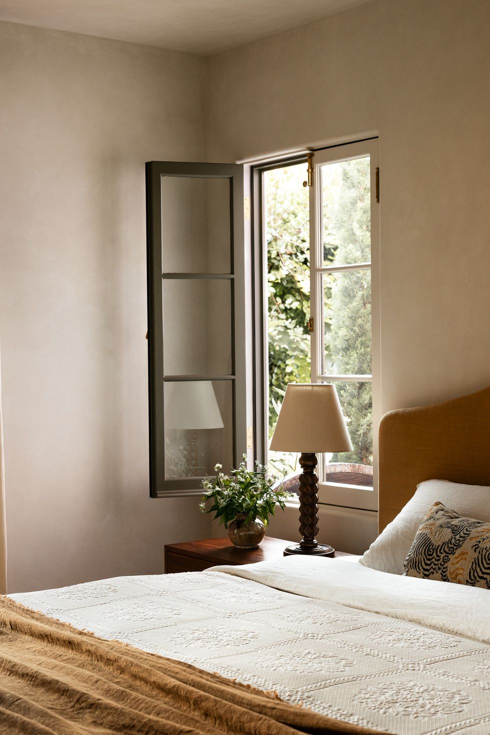
Plaster Textures

“I am gravitating towards rustic stone and plaster, specifically using them together as I think the juxtaposition of the two opposing materials side by side is so beautiful. Moving into warmer months for me also means turning away from the darker, heavier colors, specifically with undertones of brown or orange and instead embracing more vibrant colors that reflect spring and summer floral blooms like white, yellow, and green.” —Rita Donahoe, owner and principal designer at Rita Chan Interiors and TALD Member
Pops of Color
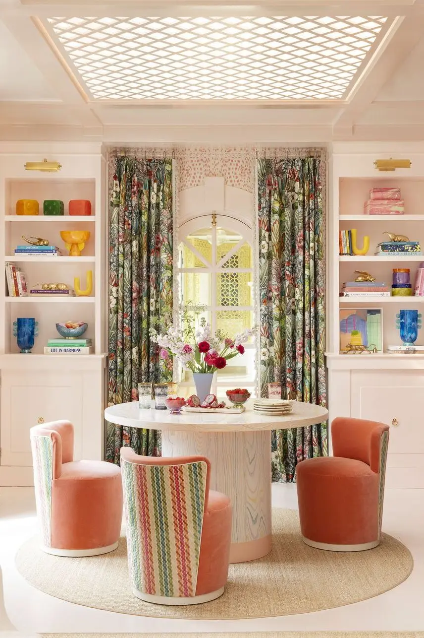
“This spring, I’m seeing people becoming much braver with color and pairing warm, earthy neutrals with pops of bright primary colors like vibrant acid yellow, lovely lime green, bright oranges, and an accent red. Using a pop of color brings such a gorgeous sense of optimism into a space—just like spring. This trend is also timeless, as the primary color is an accent, and the neutrals the accent is paired with will stand the test of time.” —Tash Bradley, color psychologist and director of interior design at Lick Paint
More Personal Design
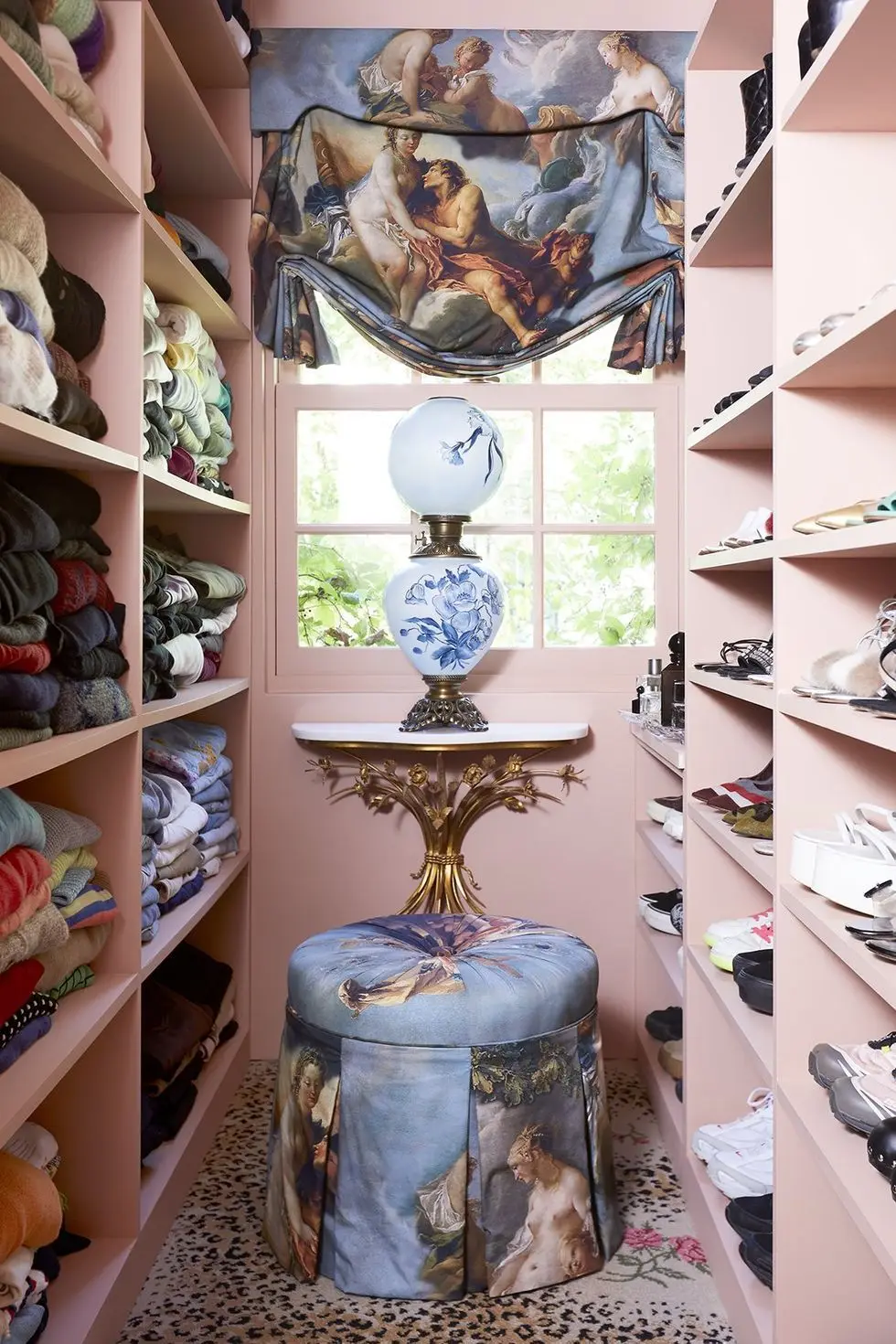
“I feel like for a while a good portion of the design world has seemed like it has become a little bit homogenized, but I think more designers and individuals are starting to tell their own authentic stories, utilizing the colors and textures and materials that are truest to their clients’ stories or lives. Perhaps the trend is just more personal design, and I love that. I want to see a variety of ideas, perspectives, and styles versus so much of the same look. It’s so much more inspiring to see creations that are totally unique!” —Rita Donahoe, owner and principal designer at Rita Chan Interiors and TALD Member
Advertisement – Continue Reading Below
Small-Scale Florals
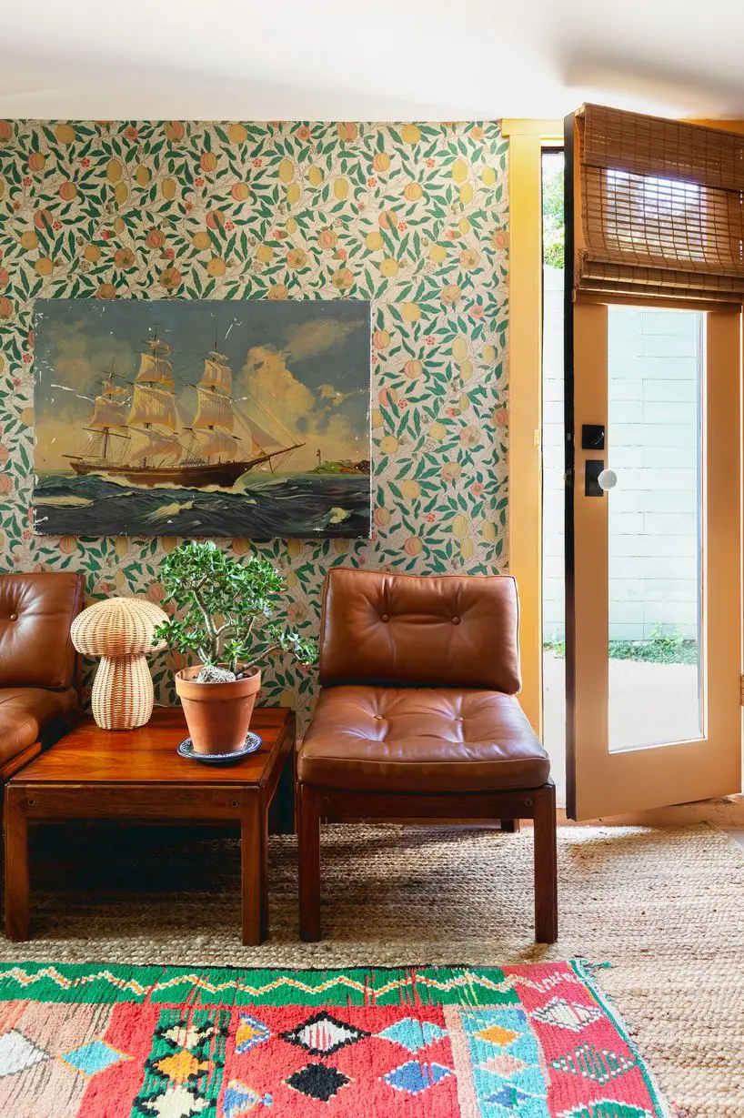
“For spring we are excited to see dramatic color in small doses. Unlikely color combinations are here, and we are excited to infuse reds, pinks, and saturated colors together to create interest and cheer in a space. We are looking at wallpapers and paint to add color and pattern. We are happy to add small-scale florals as well as bold patterns into our homes.” —Shelby Van Daley, founder and principal designer at Daley Home
Dusty Earth Tones
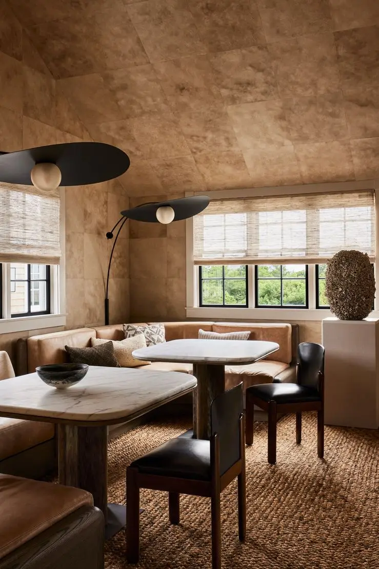
“Dusty earth tones are continuing to dominate the industry, and I think we will see even more of this as we enter spring. Adding natural elements into home decor is also a trend we are seeing on the rise, as well as incorporating vintage pieces into the mix. People are opting for statement pieces that really create wow moments in a home versus overaccessorizing.” —Meredith Owen, founder and principal at Meredith Owen Interiors
Oversized Branches
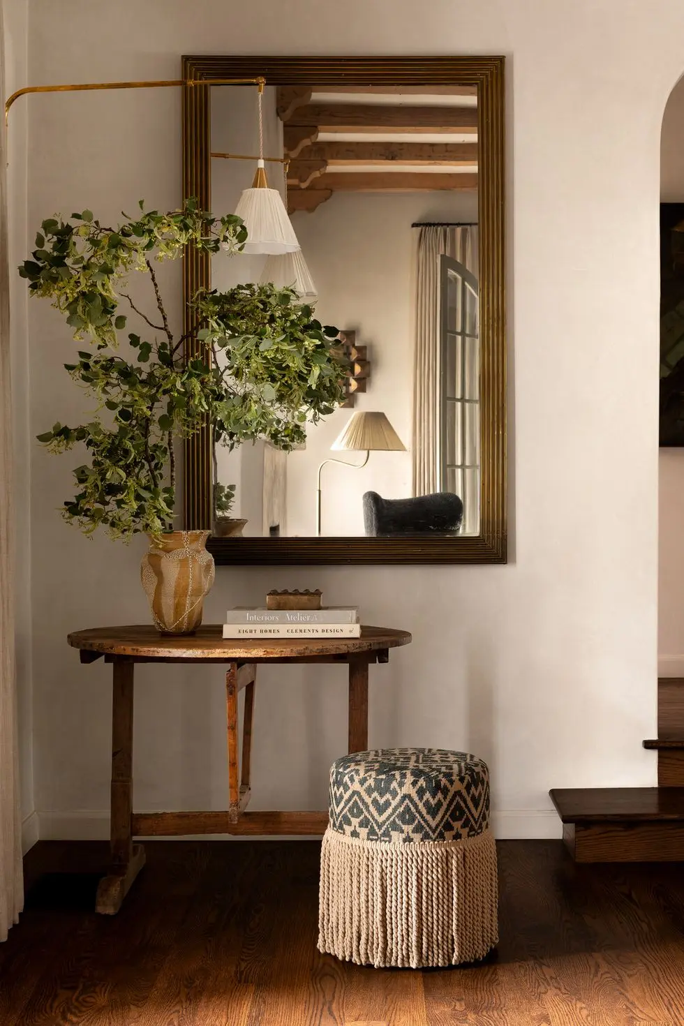
“I love incorporating organic elements in my decorating. Whether faux or real, plants and stems breathe life into any space. If you can only make one change seasonally, I recommend refreshing your greenery with seasonal varieties. In the spring, I am especially drawn to large-scale flowering branches for a dramatic display.” —Summer Little, owner and principal designer at Prescott Design and TALD Member
Advertisement – Continue Reading Below
Botanical Prints
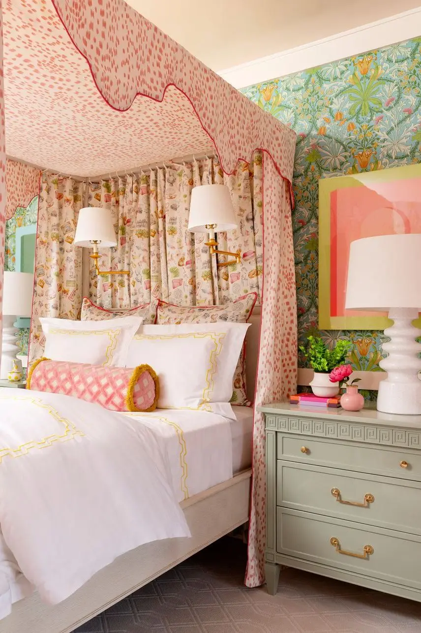
“In terms of pattern, I’ve seen nature-inspired novelty prints gain popularity this season. Overall, there’s a growing emphasis on the use of color and a mix of patterns in design, along with a resurgence of classic menswear-inspired patterns like plaids, houndstooth, and jacquards.” —Lindsie Davis, founder and principal designer at Blueberry Jones Design
Metal Surfaces
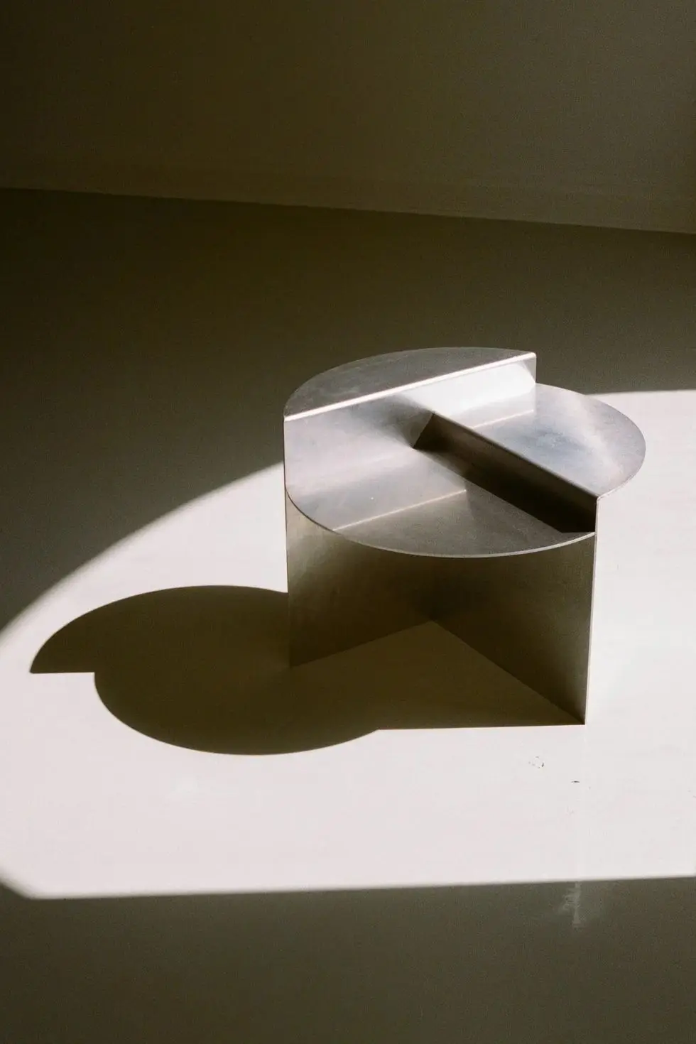
“There is a more eclectic mix of materials and styles emerging. I think we will see more classic shapes and patterns mixed with industrial-feeling pieces like the Frama Rivet table. I would also say our palette is definitely lighter lately, moving away from the heavier natural colors like dark greens and browns. We have instead been drawn to lighter blues and purples, as well as reflective materials.” —Colin Stief, interior designer and partner at General Assembly
Mustard Yellow
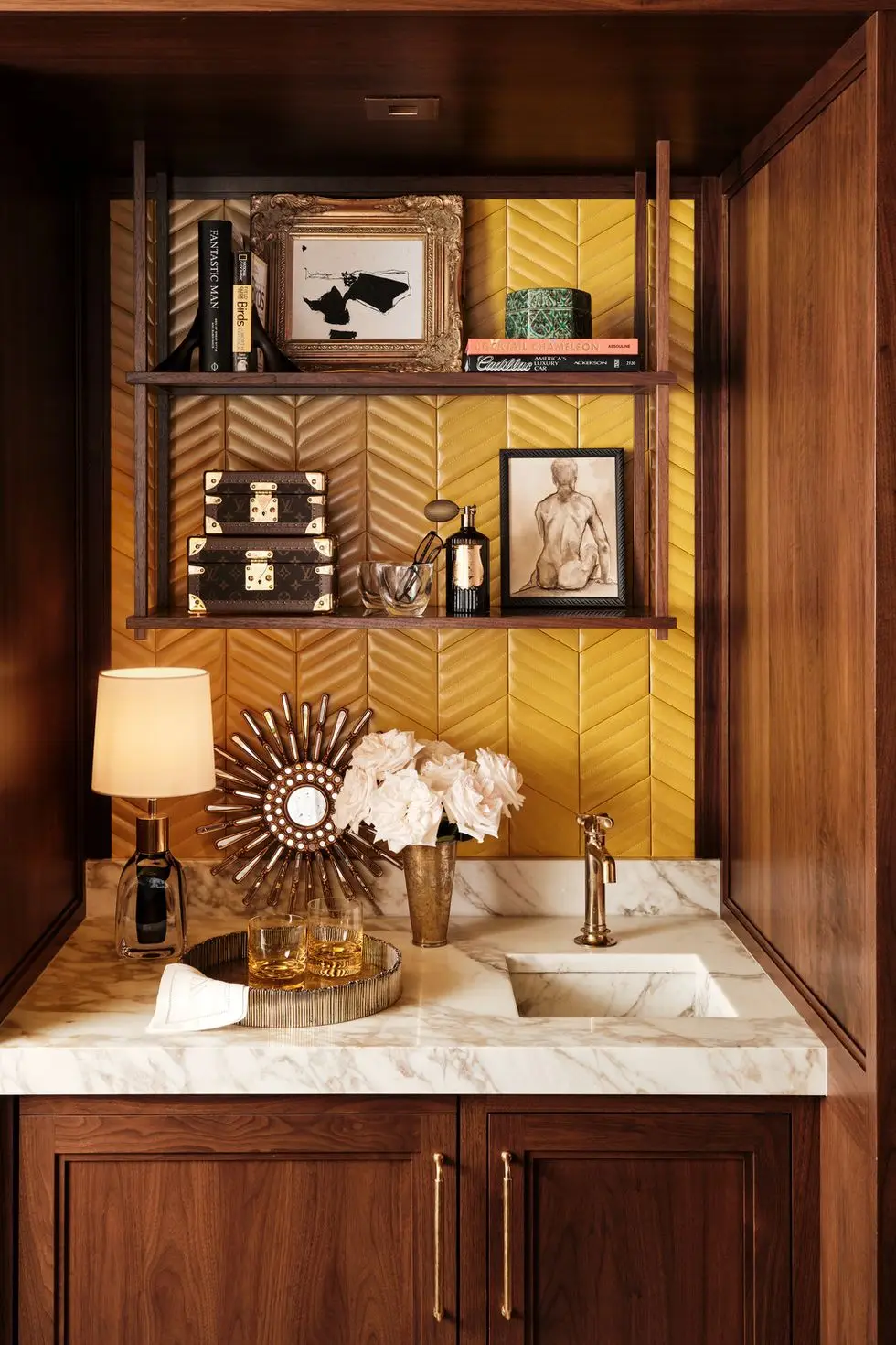
“Mustard yellow—we’re partial to India Yellow by Farrow & Ball—is the perfect blend between warm and vibrant. With its brown undertones, this hue can be paired with a warm white for a light mood or a deep brown for a rich contrast.” —Maria Vassiliou, interior architect and owner of Maria Zoe Designs
Advertisement – Continue Reading Below
Curved Silhouettes
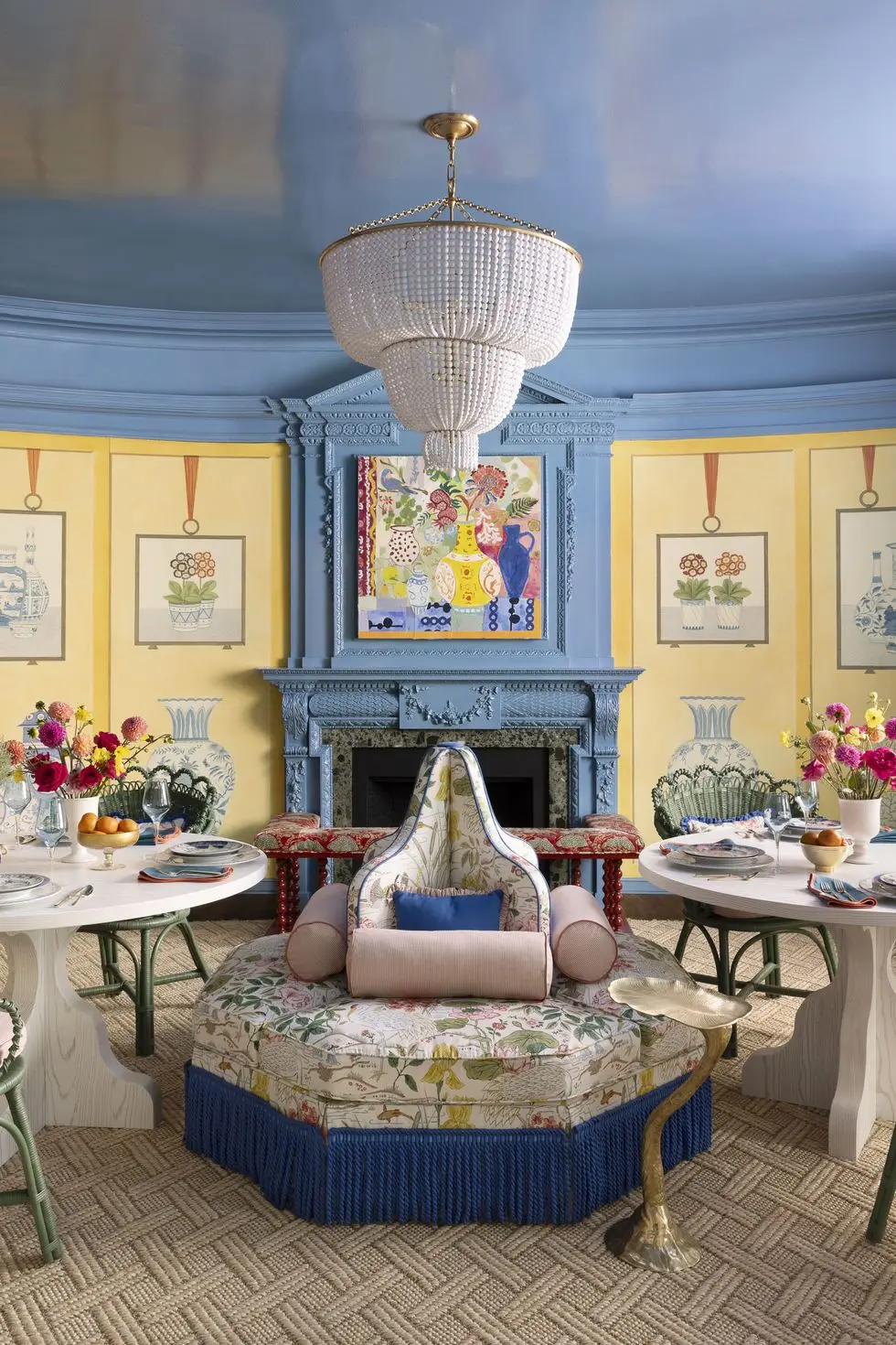
“One word that keeps coming up time and time again among my clients is cozy. To make a space cozy, relaxed, and welcoming, use any materials with an organic form and no sharp edges. I’m seeing this more and more through circular sofas, a round kitchen table, or headboards with a wave to them. Anything circular will give you that cozy and wholesome feeling. ” —Tash Bradley, color psychologist and director of interior design at Lick Paint
Advertisement – Continue Reading Below
Advertisement – Continue Reading Below
Advertisement – Continue Reading Below
