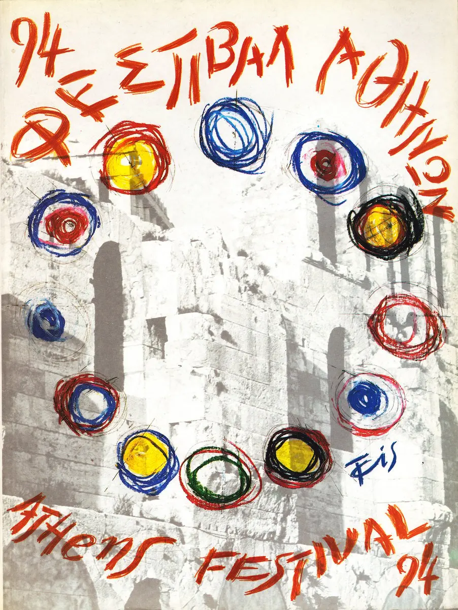
When the Athens & Epidaurus Festival was launched in the summer of 1955, it immediately paid close attention to its visual identity. The festival entrusted its image to some of the most prominent figures in Greece’s graphic and visual arts scene, sending a clear message: a “celebration of the high arts” demanded a refined, elegant and compelling public face.

The festival’s first poster was created by the renowned set designer Giorgos Anemogiannis. In a distinctly Doric style, he used a black-and-white photograph of a section of the Ancient Theater of Epidaurus, overlaying it with bold white archaic lettering that read “Athens Festival.” He also designed a stunning poster for the 1957 edition – an artwork that blurred the lines between set design, painting and graphic design.
Modernist spirit
It was in the early 1960s, however, that the modernist spirit of Michalis Katzourakis and Frederick V. Carabott brought a new creative vitality.
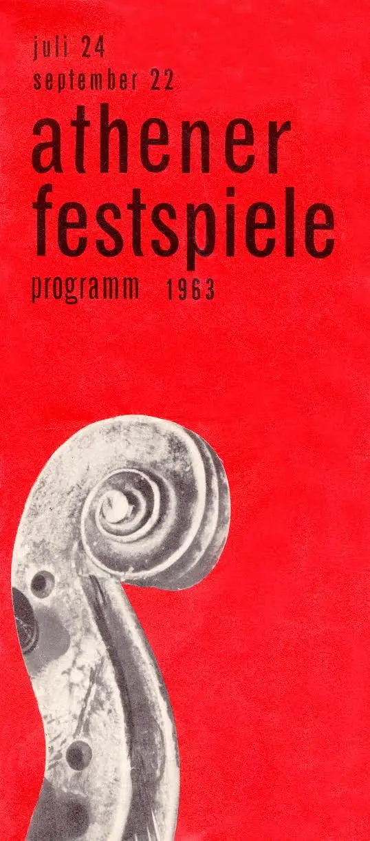
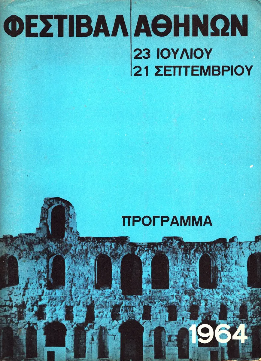
Having founded their pioneering creative agency, K&K – Athens Publicity Center, they introduced bold block colors, modern typography and abstraction. One can admire the power of the 1963 campaign, in which Katzourakis placed the scroll of a violin – cut out from a black-and-white photograph – against a vivid red background, evoking the shape of an Ionic column capital. In the 1964 campaign, designed by the inimitable Carabott, the Herod Atticus Theater is silhouetted and bathed in an intense blue filter, making the paper appear almost self-luminous and the composition feel like a vision from the future. In both cases, modern Sans-Serif lettering reinforced this fresh, contemporary aesthetic.
As Katzourakis himself explained: “Our aim was to move the poster away from detailed illustration and toward a more essential visual function, through the immediate connection of a minimal visual element with a clear message. That is, to simplify both components – image and text – in order to prompt perceptual engagement and achieve direct visual communication.”
This approach is what Angelos Prokopiou, professor of art history at the School of Architecture of the National Technical University of Athens (NTUA), once described as “the creative breakthrough – the soul of advertising art.” Designer Spyros Karachristos, writing for the major K&K retrospective at the Benaki Museum in 2008, added: “It is what later became solidified in advertising jargon as the concept.”
Brochures & programs
Well-designed, emotionally charged street posters – sculpted by the hands of “giants”– formed the festival’s first public image, its initial point of contact with art-loving audiences. Less widely known, however, is the design legacy of its brochures and printed programs.
Holding a rare printed program from the 1960 festival, we embark on a miniature journey to rediscover the visual pulse of this major cultural institution in a more intimate, tactile form.
The cover is made of heavy, luxurious paper, coated in a rich, eye-catching terracotta red. The booklet contains 84 saddle-stitched pages, in a size slightly shorter than the standard A4 (21 by 28 centimeters) – an uncommon proportion that gives it the feel of an art album. The title, “Athens Festival 1960,” is written in a hand-drawn Didot-style typeface, paired with an elegant illustration of a bee.
In our search for the designer of the cover, we discover it is none other than Yannis Tsarouchis. While his name is widely associated with the stage sets he created for festival productions – including the legendary 1960 performance of “Norma” by Vincenzo Bellini, starring Maria Callas at Epidaurus – few know that he also contributed to the festival’s printed materials. A look into the archives of the Greek National Tourism Organization (GNTO) reveals that Tsarouchis also designed the program for the following year.
As we leaf through the thick, textured pages of the 1960 edition, it becomes clear we’re holding a time capsule – one that transports us back to a defining cultural moment and offers a vivid taste of the era’s spirit. The second spread features, on the left page, a black-and-white portrait of the great opera singer, captioned “Maria Callas at Epidaurus,” while the right page lists, in archaic-style capital letters, the distinguished artists performing at the Herod Atticus Theater, from the French troupe Marie Bell to the American Ballet Theater.
Pride and optimism
From this double-page spread radiate national pride and optimism – a new strength and hope – capturing the sense of a country emerging from the shadows of war and beginning to build what would later be celebrated as the “Greek Spring,” a cultural renaissance spanning the arts. This sense of creative flourishing is also reflected in the advertisements scattered throughout the booklet, including one from the respected Doxiadis Associates architecture firm and another from Olympic Airways, proudly declaring: “Daily flights with Comet 4B.”
One delightful surprise is a witty cartoon by Bost (the pen name of Chrysanthos Mentis Bostantzoglou), a small “unknown masterpiece” that wryly captures the explosive expansion of the new concrete-clad capital, shaped by the post-war “antiparochi” system (whereby owners provided land to builders in exchange for a number of future apartments). The cartoon depicts a burly ancient hero lounging at a café table, sipping a Greek coffee, while towering apartment blocks rise above him with signs proclaiming “Hercules Cement.”
Among our archival treasures is also a work by illustrator and set designer Dimitris Rikakis, who created stage sets for productions in Vienna from 1955 to 1958 and served as an artistic advisor to GNTO in Frankfurt from 1959 to 1963. His drawing, featured on the cover of a tri-fold brochure for the 1965 festival, exudes a scenographic sensibility reminiscent of Anemogiannis’ 1957 design. It’s a striking illustration that reveals the depth of Rikakis’ talent – an “elusive” figure in Greek design history.
Rebranding
“The festival is its people – creators, contributors and audience. A living gathering of culture lovers who, each time, co-create the shared experience of art,” declares Beetroot on its Instagram profile. For a second consecutive year, the Thessaloniki-based design studio is behind the festival’s summer campaign – this time centered on a series of hand-drawn portraits: “Among them iconic figures, writers, composers, playwrights, actors and even mythical beings who together form the history – and the essence – of the festival.”
This “parade” of faces, painted in quick, bold black brushstrokes against vivid block-color backgrounds, offers a playful nod to the landmark campaigns of the past, while forging a bridge to the present.
Another milestone in the festival’s visual identity came with the 2021 rebranding by the creative studio DpS, led by Dimitris Papazoglou.