An interior designer with 14 years of experience shares the 10 decor mistakes she hates seeing in people’s homes

An icon in the shape of an angle pointing down.
Joe Hendrickson/Getty Images
- Interior designer Manuella Moreira shared home-decor mistakes she hates to see in a space.
- Boring powder rooms and blank ceilings are missed opportunities for home decor.
- Repeating too many of the same wood tones or metal finishes can make a room one-dimensional.
Decor trends come and go, but some will always be faux pas.
And with home prices rising more than double the pace of inflation since the 1960s, making the place you live look great is as important as ever, whether it’s a rental or your expensive dream abode.
To learn about things you should avoid when decorating a space, Business Insider spoke to Manuella Moreira, Los Angeles-based interior designer with 14 years of experience and founder of Manuella Moreira Interiors,
Here are the 10 decor mistakes she hates to see in other people’s homes.
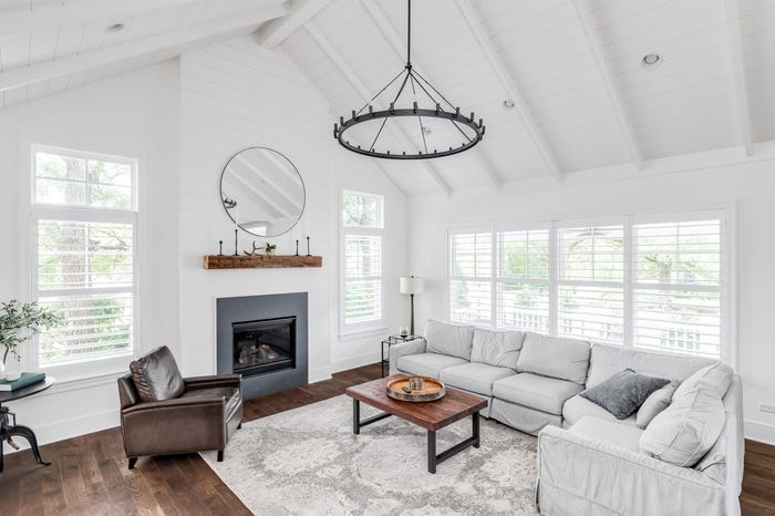
Moreira said she always notices when a room has a rug that’s too small
“Select a rug as big as possible for the space, allowing it to anchor the furniture in the room,” Moreira said. “This will also make the space feel bigger and help with the acoustics.”
Your rug should also be flat enough that it fits under the gap of doors as they swing open and closed, she added.
Nightstands should never be way taller or shorter than the bed they’re next to
Woko / 500px / Getty Images
She also dislikes when nightstands are not the right size for the bed they’re anchoring
“The height of the nightstand should be within 2 inches from the top of your mattress,” Moreira told BI. “This allows for easier reach and looks more proportionate.”
A blank ceiling is a missed opportunity
Always consider the ceiling when designing your space.
“Adding wallpaper or contrast paint to the ceiling allows you to add height, depth, and draw the eye up,” she said.
The ceiling is also an opportunity to add another texture to the room.
By thinking of light fixtures only as functional, you’re missing out on decor opportunities
sellbetter/Getty Images
According to Moreira, thinking of light fixtures strictly as functional is a big mistake.
“Light fixtures are a great way to add an artful element to a room,” she told BI. Choose fixtures that are sculptural, but also complement the architecture.
By hanging drapery hardware too low, you’re sabotaging your own space
Draperies should be at a height that allows them to just kiss the floor, the designer explained. This gives them a very custom look.
“The drapery rod should be hung as high up as possible, close to the ceiling,” Moreira said. “This adds height to the window.”
Repeating too many of the same wood tones can make the room look one-dimensional
It’s not ideal to buy furniture in matching wood tones when decorating a room, Moreira told BI.
In fact, your furniture should never look like you purchased it all at once or that it’s part of one set.
“Consider staying within the same hue but playing with the tone or texture of the woods to add dimension and look curated,” the designer said.
A boring powder room is a missed opportunity to make a statement
Fiordaliso/Getty Images
“A powder room is a great place to get creative, take risks, and go bold,” she told BI. “Use wallpaper, paint the millwork, and/or the ceiling.”
Special details, like a really cool light fixture or an interesting mirror, can make a statement and be something that your guests will talk about.
A space with warm and cool light temperatures will look busy
The designer hates to see warm- and cool-toned light bulbs within a single space.
“It’s important to make sure the color temperature of the light bulbs or architectural lights are all the same within the space,” Moreira said. “Otherwise, it will look like the lights were an afterthought and look very busy.”
Buying the wrong-sized furniture for a space can make it feel too empty or crowded
The scale of your furniture is so important. When shopping, she said, consider the floor space you’re working with as well as the architecture of the room.
“You should have good traffic flow within the space, but it should never feel like it’s missing a piece or feel empty,” Moreira told BI.
Try to avoid completely matching metal finishes within a space
“Many people are very afraid of mixing metals and prefer all of the finishes to match exactly,” she said. “I always encourage my clients to mix metals.”
This allows the space to evolve over time and gives you more flexibility when introducing new items into the space.
