There is no singular Polish aesthetic. How could there be? Poland is a massive country whose borders have been redrawn several times in the past century alone and whose cities and towns have been occupied by hostile invaders, including the Nazis and Soviets. In Poznan, a former Prussian medieval city on the Warta River three hours east of Berlin by car, Polish interior designers Zuza and Piotr Paradowski—the married couple behind Paradowski Studio and home decor brand Dom—have designed a light-filled apartment for a young family that draws on the nation’s complicated history.
Since founding their firm in Kraków in 2014, the Paradowskis have worked primarily on private residences and retail stores in their homeland. They are at the van-guard of what could well become a unified contemporary Polish design approach. Their signature is to mix elements of modernism—which trickled into Poznan from Germany, where early-20th-century Jugendstil buildings abound—with the Eastern Bloc Brutalism of the 1960s and international postmodern movements of the ’70s and ’80s, such as the Memphis Group. Above all, they say, the biggest influences on their work are Polish postwar avant-garde artists like Władysław Strzemiński and Maria Jarema. “We are really in love with Poland,” Zuza says.
When conceiving the interior scheme of the 2,700-square-foot open space, which contains mostly custom elements mixed with a smattering of vintage furniture, the first thing they had to consider was the soaring 17-foot ceiling. To wit: Scale was a major concern. Some pieces, like the sand-yellow postmodernist-inspired bookshelf opposite the kitchen, with hardware in handblown amber glass, extend the entire height of the wall.
Others, like the hulking units they refer to as “blocks,” which they designed to create divisions throughout certain rooms, measure one-half the ceiling height, leaving a dramatic gap of more than eight feet. The best example of this is in the main bedroom, where a freestanding monolith of Calacatta marble houses a decadent shower and abuts a Bordeaux-hued vanity on the opposite side. Is that a lot to digest? The clients thought so. “They weren’t sure at first,” Zuza says of the couple, who have two children. “But in the end they loved it.”
The second beefy division is covered in mirrors and separates the sleeping area from the pampering ablution zone. One sees the mirrors while lying in the cream-colored canopy bed. “It makes the space seem bigger,” Piotr says. “The clients asked for it because their daughter loves to dance. She needed a mirror big enough to practice.” One can imagine a young girl perfecting her second-position sauté to a soundtrack of Chopin’s Nocturnes there.
Visually, the children’s room seems like a complete departure from the rest of the home. Its youthful spirit shines through in pops of color and custom animal carvings on the walls. That’s perhaps due to the clients having come with a list of requests for the area. “The husband wanted it to have an indoor playground,” Piotr says. “He said they should have a firefighter’s pole to slide down.”
That was a step too far for the wife. “She told her husband, ‘You’re going to spoil them so much!’” Zuza says. Though the pole didn’t make the cut, they did install acrobatic equipment to keep the kids occupied. “We definitely spoiled them, but it’s also very cozy.”
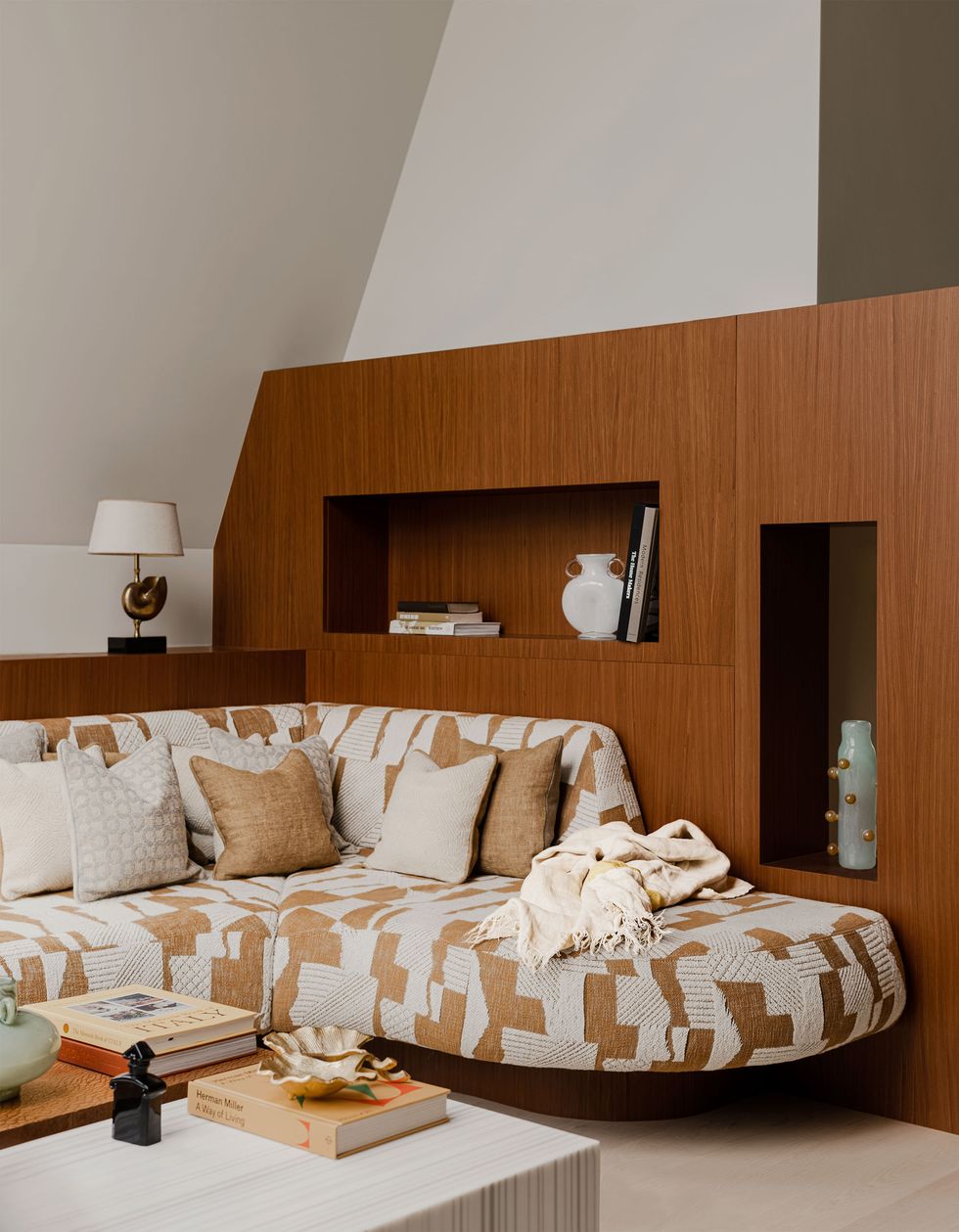
Through the pell-mell of 20th-century design influences—from the geometric patterned textiles in the living area to the various vintage accents of midcentury and Memphis Group–style furniture to the stout built-ins and Brutalist dividing cubes—it’s difficult to classify exactly where the Paradowskis fall on the shifting spectrum of international design. Ultimately, the sinew that unites all the rooms of this apartment is a diverse and evolving but deliberate Polishness. “Our work is very eclectic, in our opinion,” Piotr says, before reconsidering. “Well,” he adds, thinking of why clients seek his studio out, “not only in our opinion.”
This story originally appeared in the November 2023 issue of ELLE DECOR. SUBSCRIBE
Articles Editor, ELLE Decor
Charles Curkin is ELLE Decor’s Articles Editor, covering everything related to luxury watches, design, and travel, and has previously written for The New York Times, The Wall Street Journal, and The Paris Review.


