Reviews and recommendations are unbiased and products are independently selected. Postmedia may earn an affiliate commission from purchases made through links on this page.
Article content
Pink is still having its moment.
While this year’s hit, live-action Barbie movie may have launched a resurgence in all things pink, including all types of home decor, pink, apparently, never left the room.
Article content
“Pink is experiencing a major revival with the recent Barbiecore phenomenon,” said Charlene Threatful, founder and principal designer of Calgary’s Lush Interiors Inc. “I am not sure the pink trend ever really faded. Rather, I’d argue that this ever-popular hue has evolved. It’s become more versatile, more sophisticated, more subtle in some cases and more brazen in others.”
Advertisement 2
Story continues below
Article content
Since the Barbie movie appeared this past summer, it seemed you could find practically anything in pink you might want to add to your home. For example, there are blush pink cereal bowls and serving platters or pink upholstered sectionals, and even darker hued pink martini glasses from the Barbie x Dragon glassware collaboration.
But should you be wary that the power of pink might fizzle now that the movie has long ended its theatrical run?
“We just returned from HighPoint Market in North Carolina where all of our suppliers showcased the latest in home design,” said Threatful. “We saw a lot of pink, from the soft coral hues to bright pops of neon. It isn’t going anywhere any time soon and it is being used in everything from area carpets, lamps, sofas, art and accessories.”
Meanwhile, grey has had its day, said Threatful. She said pink is now morphing into tones of taupe, beige and even browns. For the next several years these warm tones are going to take centre stage in the design story.
So if pink isn’t leaving, how should you incorporate it into your home?
“Pink can be used anywhere in the home, in every room,” said Threatful. “Paint is an easy DIY for incorporating hues of pink. It can be used on a single wall in a room, on the ceiling or even the back of a bookcase or inside a walk-in closet or storage cabinet. One of our favourite ways to use pink on walls is with wallpaper. We use wallpaper in all of our designs, in all of these areas. It is a fun, creative way to add so much personality to a space and can be as subtle or bold as you like.”
Article content
Advertisement 3
Story continues below
Article content
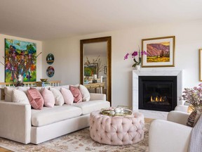
Pink, said Threatful, can be paired with many colours depending on how bold or subtle you want to be. A hit of hot pink always looks good paired with a neutral, she added, especially with accessories like toss cushions, throws or lamps. Or more muted tones of pink and coral work well with colours opposite the colour wheel like greens including teals and moss — think updated 1980s.
Upholstery is another option.
“A pale pink sofa, a hot pink velvet side chair or pieces layered with pink toss cushions work well,” said Threatful. “Pink isn’t just for upholstery as we saw at the furniture show. Every major manufacturer is offering a burled wood species in furniture, which has distinct pink undertones. Think desks, console tables and side tables all with pale pink wood tones. These work exceptionally well in more feminine spaces.”
But that doesn’t mean pink is just for women.
“For years we have seen pink in menswear and quite often our primary suites for couples includes some use of this colour in accents such as bedsheets, toss cushions, carpets and drapes,” notes Threatful. “The application of this colour doesn’t need to be feminine and using it in a more masculine esthetic is easy with some restraint. Just a small hit of blush in accents, accessories and art works equally well in a masculine space.”
Advertisement 4
Story continues below
Article content
She also said grey and black work well with pink.
“Fashion and design parallel each other; think of black or grey menswear paired with a pink shirt, and that translates well into home decor,” said Threatful. “Shades of grey furnishings with pink accents and gold or silver accessories pulls it all together.”
New Neutral or Attention Grabber?
A new neutral? Possibly.
“From barely-there blush to a whisper of powdery pink, or a dusty, muted shade, pink can play the part when accompanied by a saturated or contrasting colour,” said Calgary’s Lush Interiors’ Charlene Threatful. “The subdued neutral, in this case pink, naturally recedes into the background, making way for a bold pairing such as vibrant green, yellow or black. As the backdrop, pink translates beautifully as an undertone on walls, subtly veined countertops, even cabinets as I used in my laundry designed space.”
Pink’s other side, however, begs to be seen. As an accompaniment to a neutral colour of white, a more-saturated brighter or darker pink is an instant attention-grabber, she said, adding this pink can be bright and sweet or dark and moody but is most effective in measured doses.
Article content

Comments
Postmedia is committed to maintaining a lively but civil forum for discussion and encourage all readers to share their views on our articles. Comments may take up to an hour for moderation before appearing on the site. We ask you to keep your comments relevant and respectful. We have enabled email notifications—you will now receive an email if you receive a reply to your comment, there is an update to a comment thread you follow or if a user you follow comments. Visit our Community Guidelines for more information and details on how to adjust your email settings.