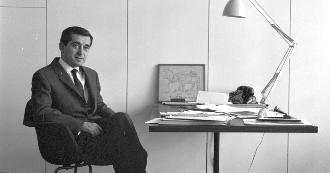
With a bevy of corporate and institutional clients, he helped shape the visual language of the postwar American economy.
George Tscherny, a leading figure in postwar graphic design whose work unified the crisp, clean lines of European modern art with an American commercial pop sensibility, died on Monday at his home in Manhattan. He was 99.
His daughter Carla Tscherny confirmed the death.
Mr. Tscherny (pronounced CHAIR-nee) started his career in the early 1950s, near the beginning of an extended golden era of American consumerism and corporate growth — a period that demanded new types of advertising.
Many of the designers who crafted the signature images of the era were European immigrants, often refugees like Mr. Tscherny, who brought a familiarity with the latest in modern art and design. Their work graced advertising campaigns, produced on Madison Avenue, that pushed cigarettes and toothpaste and jet travel into American homes.
After apprenticing in Manhattan design studios for five years, Mr. Tscherny opened his own practice in 1955. He soon had a client list that read like a Who’s Who of postwar corporate America. American Can, Colgate Palmolive, Pan Am and RCA all hired his office to design advertising, logos and annual reports.
His work differed from that of the many graphic designers who gravitated to the so-called Swiss style, an austere, stripped-down aesthetic heavy on grids, clean lines and abstraction. He brought in humor and humanity: For an ad for Overseas National Airways promoting winter travel, he arranged silhouettes of airliners to resemble a snowflake.
“He did not follow a set condition of rules,” Steven Heller, a former art director for The New York Times who now teaches at the School of Visual Arts in New York, said in a phone interview. “There was always a jolly wit to his work.”
Mr. Tscherny once described his design approach as “maximum meaning with minimum means”; he also called it “the human element implied.” One famous poster, for the furniture designer Herman Miller, featured a cowboy hat sitting on one of the company’s signature chairs and the text “Herman Miller Comes to Dallas.”
“I see myself as a bridge between commerce and art,” Mr. Tscherny said in an interview for the Art Directors Club in 1997, when the club inducted him into its Hall of Fame. “For just as copy can be literature, design can be art when it reaches certain levels of originality and distinction.”
George Tscherny was born on July 12, 1924, in Budapest. His father, Mendel, was a Russian soldier during World War I who was captured by Austro-Hungarian forces and imprisoned in Hungary; when the war ended, he stayed.
George’s mother, Bella Tscherny, a Hungarian Jew, worked as a seamstress.
The family had very little money, and when George was 2 they moved to Berlin to escape antisemitism and to be close to some of his mother’s relatives, who helped support them.
He recognized from an early age the way that high art and commercial art overlapped, blended together and even nestled inside each other. There was perhaps no better place for that education than Weimar-era Berlin.
“Growing up in a poor, working-class household, I had to find art and culture outside the home,” he said in a 2014 interview with Print magazine. “Modern architecture, which began to appear on the streets of Berlin around 1930, captured my interest on walks through the city.”
The family came under pressure to flee Germany as the Nazis took power in the 1930s. In 1938, a day after the Kristallnacht pogrom, George and his brother, Alex, boarded a train to the Netherlands, where they lived in a home for refugee children.
Their parents emigrated to New Jersey, but it would be three more years before their children followed them there.
Mr. Tscherny joined the U.S. Army during World War II. He served in France, as a translator, and later in occupied Germany. After he was discharged in 1946, he studied for a time at an art school in Newark and then transferred to Pratt Institute in Brooklyn.
He married Sonia Katz in 1950. She died in 2020. Along with his daughter Carla, he is survived by three grandchildren. His brother, Alex, died in 2020. Another daughter, Nadia, died in 2019.
With only a few credits to go before graduating, Mr. Tscherny left Pratt in 1950 to work for Donald Deskey, a renowned industrial designer. In 1953, he moved to the office of George Nelson, where he worked primarily for one of Mr. Nelson’s biggest clients, Herman Miller.
He left in 1955 to start his own firm. That same year he answered a want ad for a design teacher at what was then known as the Cartoonists and Illustrators School and is now the School of Visual Arts, in Manhattan.
Although Mr. Tscherny taught there for only eight years, he left an indelible legacy at what would become one of the country’s leading schools for aspiring art directors. He created its graphic design program, and he later joined other artists in creating a famous series of ads promoting it in New York’s subways.
In 1996, he unveiled the school’s familiar squiggly-flower logo, which it still uses. It was classic Tscherny — positioned next to the school’s name, written in what he called the “icy perfection” of the elegantly formal Bodoni typeface, the scrawled image signals the “human element” behind all design.
“It reflects what S.V.A. has become: an art school with a broad range of offerings, from technology-based programs to painterly pursuits,” Mr. Tscherny said. “I think the logo avoids the ‘hard edge’ sameness of the usual corporate trademark.”
