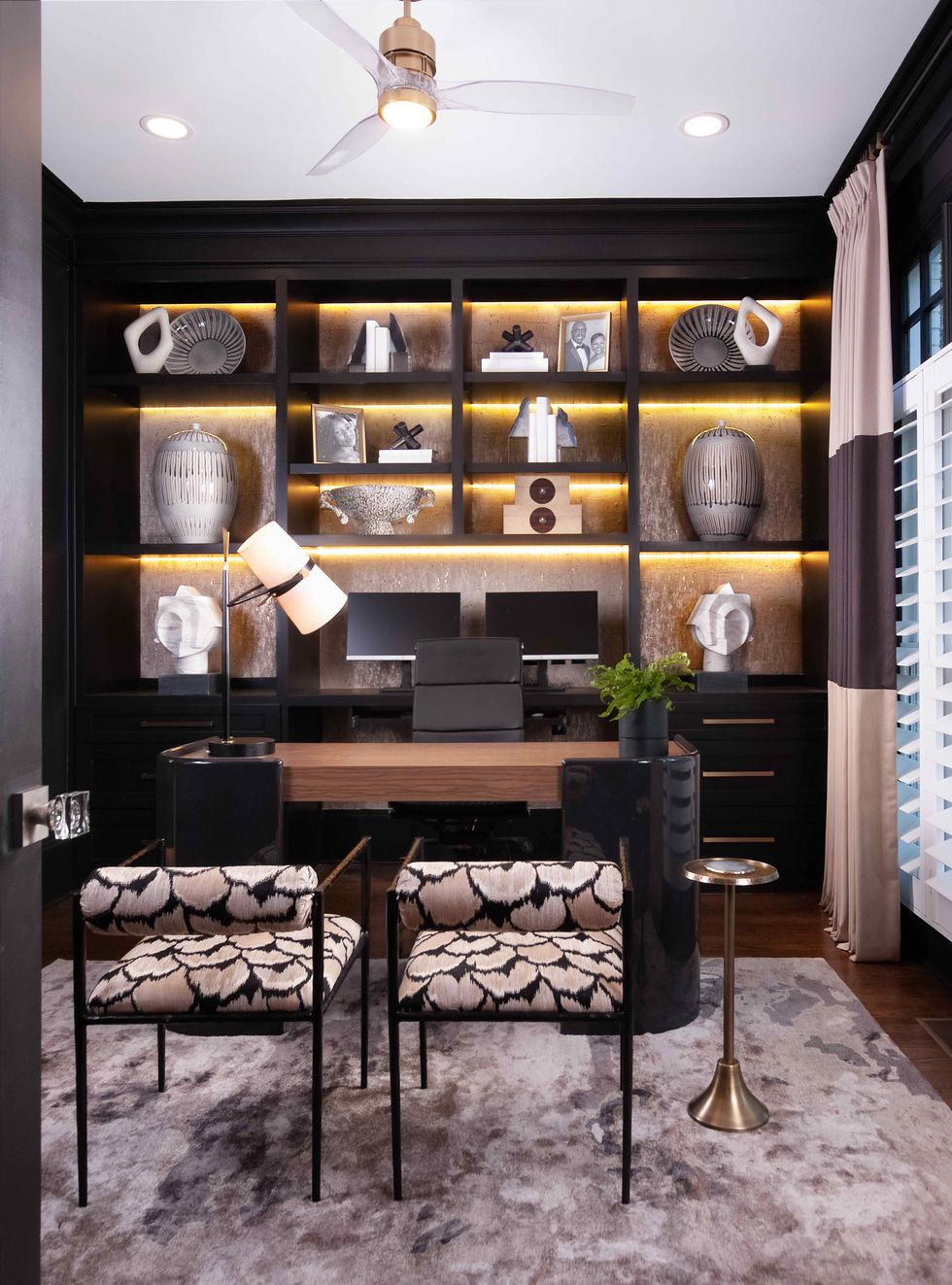
The client’s request seemed straightforward at first: Transform a bland guest bedroom into an elegant home office. But Barbara Elliot and Jennifer Ward-Woods, partners in the Atlanta-based design firm The Sisters and Company—part of Decorating Den Interiors, a collective of individually owned and operated design firms across the U.S.—soon saw there was a fine line to walk. The homeowner wanted the office to be distinctly masculine—a “casual gentleman’s space,” as the designers describe it. But because the room is situated just off the foyer and visible immediately upon walking in the front door, the decor still had to be cohesive with the rest of the home.
What’s more, though the office would serve as a retreat with an air of privacy, it had to simultaneously function as a somewhat public space, since its attached bath doubles as the home’s guest bathroom. What they needed to achieve here, they realized, was a paradox: a sanctuary that visitors nevertheless would feel welcome to enter.
Elliot and Ward-Woods solved the puzzle with a clever design that encompasses a fully functional workspace, yet looks like a luxurious (if mini) living room. Here are the guiding principles behind their transformation.
Forgo “office furniture”
The pair immediately dismissed the idea of a traditional, imposing executive desk—they wanted the room to feel open and inviting, not blocked off by a behemoth chunk of wood. Instead, they commissioned a wall of custom cabinetry that could accommodate the owner’s dual monitors (creating a space truly made to work in) as well as provide storage, leaving them free to select a desk for appealing aesthetics rather than pure practicality. Without weighty stacks of drawers on the sides, the wood-and-lacquer model they chose “floats” off the floor on slim legs, and its rounded-off corners and slim shape call to mind a high-design table rather a mere place for paperwork.
Similarly, while the bolster-back chairs—“our showstoppers for the space,” Elliot says—face the desk, at the ready for meetings, their eye-catching pattern and delicate hammered-metal frames feel just as suited to giving party guests a place to perch. To further that “come right in” vibe, Elliot and Ward-Woods placed a pedestal cocktail table nearby—a subtle signal that this room is not all work and no play.
The chair fabric, with its mix of black and earth tones, was also the jumping-off point for the room’s color palette, which the designers anchored with bold black paint for the walls and cabinetry. “I think it has a moody, casual, elegant feel to it,” Ward-Woods says. “It definitely screams ‘masculinity.’”
Style shelves to be seen
Another of the designers’ techniques for making the room both private and welcoming was to confine office supplies and other utilitarian items to closed storage. This allowed them to devote the open shelves to beautiful decoration—not just a place to put stuff, but an artfully curated display. Wallpaper threaded with quartz shimmers on the backs of the shelves, reflecting the colors in the room and achieving a textural effect that’s an ideal backdrop for the stone and ceramic art pieces and accents. The end result is a space that, from the vantage point of the guest chairs, telegraphs that it’s an office only via the two monitors.
Deliver a little dazzle
The client wanted the office’s bathroom—also the guest bathroom—to “feel like you were in a swanky nightclub,” Ward-Woods says. Achievement unlocked: The black-and-white color scheme, floor-to-ceiling dimensional tile, and dramatic crystal teardrop pendants are clearly meant to be seen and appreciated, and no one entering this splashy space could feel as though they’re intruding on someone’s personal turf. Especially not when the grand, backlit mirror and beckoning under-vanity lights turn on automatically when someone enters—one more ingenious detail that makes this home office as much about pleasure as business.


