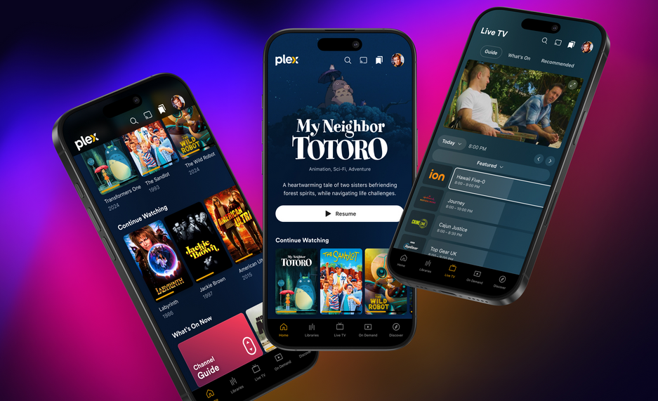
Plex, the free streaming app and media server, has announced a preview of its newly reimagined Plex experience, rolling out immediately on mobile, with TV platforms coming soon.
This update, currently in preview, has been in the works for nearly two years and is designed to bring everything into one seamless interface—from users’ personal media collection to on-demand content, along with improved ways to discover and connect with it all. A public release is intended for early 2025.
“Our mission is to create a global community where everyone can discover, experience, and share all of the entertainment that matters to them. This rebuilt interface is just another way we’re staying true to this mission,” explained a Plex blog post.
“One of the key changes is redesigned navigation that makes it easier to dive into the different parts of Plex and discover content with simplicity. Through extensive testing, we found that this new structure not only helps existing users navigate more intuitively but also gives new users a much clearer sense of what Plex is all about. We’ve brought our core features to the forefront, saying goodbye to the days of hidden hamburger menus and making it easier to explore with one hand on your phone,” added the blog,
Plex continued: “Thanks to its popularity, we’ve given Watchlist its own dedicated spot in the top navigation for faster, easier access. Since its debut, we’ve seen an amazing surge in the usage of this feature. More and more of you are taking advantage of finding any title, anytime, wherever you are, and linking directly to it across services or adding it to your Watchlist.” Other updates include a variety of reorganising features such as streamlining the user menu.
The redesign features expanded use of artwork throughout the app, bringing visual richness to the user experience. Plex has also introduced title artwork for movies and shows where available.
