Throughout the past 150 years, Coors has been many things: beloved beer brand of the American West; survivor of Prohibition; aluminium can innovator; boycott target and, later, beneficiary; household name and on the receiving end of more than a few jokes.
Today, the brand is changing shape again as it confronts a new reality in its home market: US consumers are drinking less beer.
In a landscape replete with hard seltzers, spirits and all flavours of booze-free fizzy waters, more people are looking to alternative beverages. The shift has been underway for several years, and in 2022, US spirit sales surpassed beer sales for the first time ever.
Molson Coors, the multinational company behind Coors, Miller, Blue Moon, Keystone Light and dozens of other popular beer brands, recorded a 5% or 2.2 million-barrel decline in US volume last year, according to data from the Boulder-based Brewers Association, first reported by Axios.
Executives have acknowledged consumers’ changing “lifestyle choices” and the “softness in the beer industry” on earnings calls. Yet they’ve also painted a characteristically optimistic picture of the road ahead. This is partly because the company has prepared for these transformations: its biggest brands are today on an upward trajectory in sales and market share, and it has steered its product line-up towards growing categories like whiskey and energy drinks in recent years.
To keep up with the pace of culture, brands are in a constant state of reinvention, from changes as subtle as a tweaked typeface, to wholesale overhauls of their portfolios and positionings. Rebrands can help a cereal box stand out on a shelf, make an insurance company’s logo look cleaner on a phone screen, draw attention to the star ingredient in a new shampoo or convey a tech conglomerate’s expanded scope.
“If they’re done right, they’re barely perceptible to the audience,” says Deb Gabor, the US-based founder and CEO of Sol Marketing and the author of several books on branding. “Everyday consumers just feel more resonance and emotional connection and indispensability from the brand.”
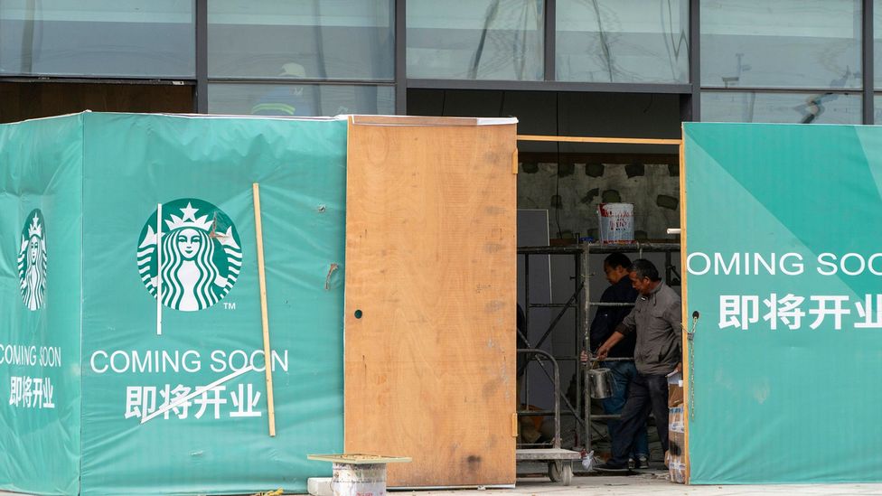
Starbucks dropped the words “Starbucks Coffee” from its logo to create a icon that could be recognised around the world (Credit: Getty Images)
Appetite for evolution
Coming out of the pandemic, Gabor says she is seeing a wave of companies eager to revitalise their brands to adapt to the seismic changes in consumers’ lifestyles, habits and priorities.
Coors, after all, is hardly the only brand that’s facing a challenging market and fresh competition. Bankrupt businesses including retailers Bed, Bath & Beyond and JCPenney are getting expensive revamps under new ownership; toy company Mattel is blanketing pop culture in all things Barbie to give the decades-old doll a new lease on life; and companies including software provider Zoom and pharmaceutical company Pfizer have rolled out new logos to draw attention to their investments in accessibility and biopharma innovation, respectively.
Rebrands tend to be expensive, years-long processes – especially for massive global organisations operating across numerous channels. But if they’re executed well, they can take a declining business and turn it into a powerhouse, or make an old name feel relevant to a new generation.
A great brand can sell products, connect with customers, attract great employees and open investors’ wallets. Copious research has shown consumers are willing to pay more for brands they trust – and this translates to huge, potential earnings for these companies.
This hard-won value also makes reinvention a riskier proposition, however. Even when leaders recognise the need to evolve, they’re often wary of major changes, says Rick Wise, CEO of Lippincott, a global creative consultancy that has spearheaded rebrands for companies including Starbucks, Samsung, Walmart and Southwest Airlines.
“Typically in an organisation, you’ve got lots of fondness for the brand, and lots of trepidation about messing with the brand,” he says, “so you want to be really, really measured and adopt a stewardship approach.”
The first step his team takes is to diagnose where a brand is losing relevance or falling behind its competition. Next, it assesses how much of that can be traced back to the company’s messaging and presentation versus what it is offering customers.
“You could have the best brand in the world, but if you’re selling a car that doesn’t start, it’s not going to matter what you do with the branding,” he says.
While a new logo or campaign may be a cue for consumers to reconsider a company, these visual elements must reflect real improvements to the product or experience, he says, or else people may walk away disillusioned. Surface-level changes can erode trust instead of building it.
“The best brands in the world, when they go through a rebranding, they start with strategy first, not with a desire to just have a creative update,” says Gabor. “Actions speak louder than marketing.”
Risk and reward
When Lippincott worked with Starbucks about a decade ago to modernise its brand, the company was gearing up for a new chapter of international growth and investments in categories beyond coffee. Looking back, then, it makes sense the brand would drop the words “Starbucks Coffee” from its logo, and focus all attention on its smiling siren icon – a symbol that’s recognisable around the world without the aid of Google Translate.
Still, the decision was controversial at the time, with fans throwing virtual tomatoes at the design in Starbucks’ Facebook comments, and critics mocking the dystopian future its minimalism seemed to signal.
It didn’t help that it was unveiled while two infamous rebranding failures were still fresh in the public’s memory.
Months prior, retailer Gap ditched its blue-boxed serif logo in favour of a Helvetica font appended with a small blue square – a change that lasted less than a week under the weight of online outcry. Before that, there was Tropicana’s widely panned move from its signature straw-in-orange packaging to a design depicting a plain glass of orange juice. This, too, was quickly dropped, but not before costing the brand 20% of its sales on top of the $35m (£28.74m) paid out in marketing expenses.
")
Gap has changed its logo several times since its 1969 inception (Credit: Alamy)
Unlike these cases, however, Starbucks’ 2011 rebrand has since been generally hailed among the design and marketing sectors as a success, with the brand’s visual identity carrying through to new product launches, store remodels and packaging updates.
Tapping into new markets
Beyond setting the stage for business development, rebrands can act as overtures to new audiences.
Jell-O, for example, unveiled a new look in August that has been lauded as a savvy invitation to young consumers. The redesigned packaging features brighter colours, a chubby sans-serif font and glossy renderings of jelly fruits and pudding swirls.
“The art on Jell-O’s packaging feels fun and evokes the ‘jiggle’ and playfulness of the product,” says Heather Johnson Dretsch, an assistant professor of marketing at North Carolina State University’s Poole College of Management. For a heritage name like Jell-O, which was founded in 1845 and last rebranded in 2013, it makes sense to rejuvenate the design to appeal to the fun, exuberant branding Gen Z gravitates toward, she says.
Coors, meanwhile, has taken a multipronged approach to winning over fresh markets. Its parent company has followed through on its plan to diversify beyond beer – which it signalled in 2019 with its name change from Molson Coors Brewing Company to Molson Coors Beverage Company.
Today, Coors Spirits Co includes two brands developed in-house, Five Trail whiskey and Barmen 1873 bourbon, as well as the premium bourbon brand Blue Run Spirits, acquired in August. The company has also recently doubled down on its investment in Dwayne “The Rock” Johnson’s energy drink brand Zoa and its partnership with The Coca-Cola Company on Simply Spiked Lemonade and Topo Chico Hard Seltzer.
These categories are expected to account for a large portion of the company’s growth in the coming years, but it’s not letting its beer brands languish, either. It’s leaning into Coors’ history – until the early 1980s, the beer wasn’t sold east of the Mississippi River, lending it a unique cultural cachet – with an anniversary campaign and partnership with the hit television series Yellowstone. Blue Moon is also getting fresh packaging and a new non-alcoholic line geared at the fast-growing share of consumers reaching for booze-free beer.
Rebrands are never guaranteed to win over consumers – companies don’t go through them unless they see they see their sales or market share shrinking, points out Gabor – but in its 150 years, Coors has overcome more urgent threats than consumers’ wandering tastes. For nearly two decades under American Prohibition, it was forbidden to brew beer at all.
From Gabor’s perspective, the company is making thoughtful strides into the future. “They’re trying to preserve the parts of the brand itself that are still meaningful and resonant to people while they innovate in other directions,” she says. “In many ways, what they’re doing today is making what was old new again.”