In the mid 1930s, legendary Vogue editor in chief Diana Vreeland began writing a column for Harper’s Bazaar called Why Don’t You? in which she would encourage readers to try something new, almost as an absurdly glamorous dare. Among her suggestions was the idea that readers might decorate their homes entirely in green, with a verdant mix of houseplants and glazed porcelain. But Vreeland’s personal favorite color was red, specifically “the color of a child’s cap in any Renaissance portrait.”
In 1955, she asked interior designer Billy Baldwin to create her famed New York apartment, which was completed in 1957 and later featured in the September/October 1975 issue of Architectural Digest. The living room, which Vreeland enthusiastically described as “a garden in hell,” is a master class in the art of monochromatic design. It’s not just that the room is all red: It’s that Baldwin and Vreeland combined red carpet, red upholstery, and red paint with objects that are culturally red, like playing cards and plaid throws. (Vreeland herself made the needlework pillows on the sofa.)
From the frescoes at Villa of the Mysteries near Pompeii to the walls of the Louvre to the White House’s Red Room, red conveys a certain storied, regal grandeur like no other hue. AD spoke to designers with distinctly different aesthetic points of view about a color they all love, and asked them to make the case—and share their tips—for the all-red room.
Ashley Hicks, the color-forward British designer and son of David Hicks, recalls that his father had a “flashing red” dining room in his country house in the early 1960s. Years later, at Salone del Mobile in 2022, the younger Hicks designed a red tented room for Buccellati, festooning a dining space with a sumptuous Turkish chintamani-patterned textile and pedestals, hand-painted to resemble red porphyry. Hicks points out that there’s a strong association between red and libraries, from the walls to the books, “particularly in neoclassical and Victorian libraries,” he notes. “One of my father’s great ambitions was to get all his books rebound in red,” he adds. (Hicks reports that his father got about 30 of them done.)
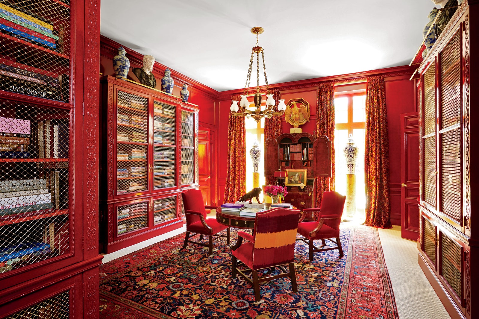
Miles Redd’s AD100 firm Redd Kaihoi also appreciates the shade’s bookish appeal and once designed a deep red library, in addition to using copious amounts of it in other projects over the years. “The thing that no one ever really tells you is that red rooms, they’re nighttime rooms, they’re for the evening, they’re for fires, they’re for softly lit silk shades. And there’s something so enveloping, rich, and wonderful about being in a red room at night with a fire going. It’s just kind of magical.”
Crosby Studio’s Harry Nuriev recently tapped into the nocturnal vibe at the New York outpost of the exclusive members club Silencio, where he put a slick, contemporary spin on the all-red genre. (The otherworldly space was partly inspired by the chic weirdness of David Lynch’s design for Twin Peaks—think Sherilyn Fenn’s lip color and the iconic bright red curtain). Looking at historic nightclub architecture and design, Nuriev found red to be the most evocative hue. “For me, [red] is the color of the 1960s and Studio 54,” he tells AD PRO.


