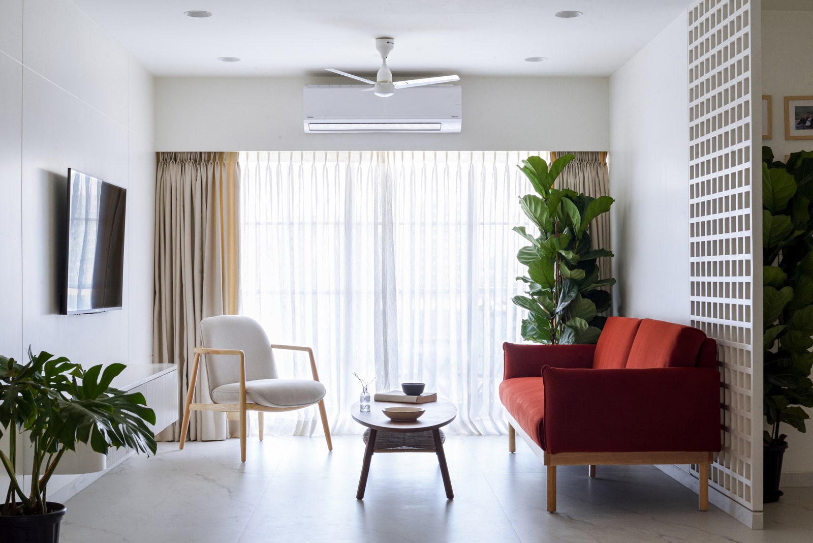
For her Mumbai home, Tadaima—which translates to I’m Home, a term used by the Japanese when they enter their place of residence—architect Chrisann Rodrigues was quite literally, home! Tadaima is an apartment space in Mumbai which was tailor-made for those she holds close to her heart, her family. Good design, they say, always starts with thoroughly understanding your client’s needs, wants and aspirations and Chrisann was at an advantage here as she already knew what the three members of her family required and aspired for in their family home. “Overall we wanted a harmonious blend of practicality, comfort, and individual style,” shares Chrisann, who heads Mumbai-based Eight Degree Design House, and worked closely with her associate, architect Devika Melwake on this project. “We’ve worked on many homes that are varied in nature and style but when it comes to our personal spaces we’ve to be authentic with our choices. So in this project, everything had to truly align with our lifestyle,” she adds.
Also read: A lavish Mumbai home where biophilia meets Art Deco glam
Anish Padalkar
Anish Padalkar
The apartment, a 2,000-square-foot 3BHK was initially twin flats of 2BHK each with builder given finishes and fittings. As the existing layout did not match the family’s requirements, all the internal walls were knocked down to create a new spatial configuration. The linear space thus formed placed the living-dining at the centre with balconies on either side. A minimalistic altar, set in the middle of this large expanse, ties the living-dining together.
Anish Padalkar
The left side of the apartment has the laundry room followed by Chrisann’s bedroom, with the common washroom opposite it. This stretch further leads to the sister’s bedroom with a connected washroom. On the right wing is the kitchen, powder bathroom and study, leading to the master bedroom with an attached washroom. With a nod to practicality, the layout seamlessly integrates essential elements like a discreet laundry room, freeing up valuable space in the kitchen and bedrooms.
Also read: These glamorous kitchen designs are on our 2024 vision boards
Anish Padalkar
Rodrigues mentions that there were three factors which helped in developing the design language of Tadaima. In essence, the cross ventilation and breeze was the key decision maker when it came to the planning of the dining and living areas in the apartment. Secondly, the design made room for things that truly mattered, for instance, the materiality (of furniture pieces) reflect the minimalist lifestyle the family leads. And the foremost—each family member’s personality was combined to form a cohesive palette which dictated the direction of the design especially in their private rooms.


