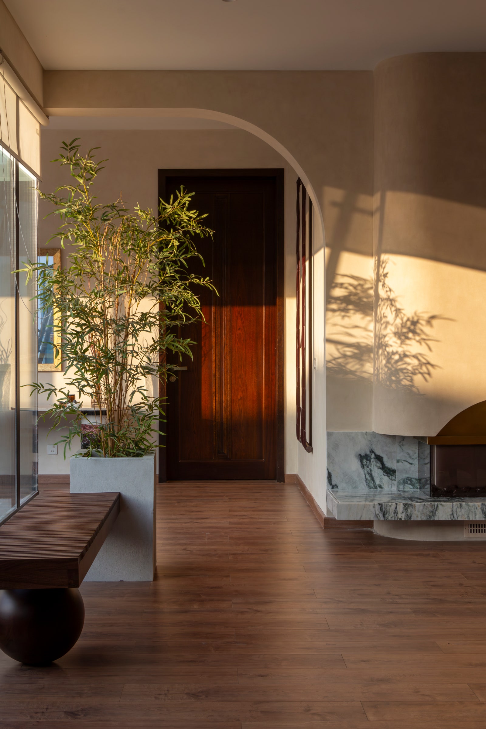
If a mother knows best, a mother-in-law knows ‘best-er’. At least in matters regarding her daughter-in-law, or more specifically, welcoming her their Lahore home. For the matriarch of the Zulfiqar family, her son’s imminent wedding prompted a bevy of seminal overhauls, chief among them the renovation of one wing of the family’s newly constructed Lahore home, to serve as a newlywed nest for the young couple. The first step, of course, was finding a designer—or two—to take up the design reins. Enter Aleeya Khan and Masshal Saif of Lahore-based multidisciplinary design practice *alittlemore studio, a spinoff of ALEEYA. design studio, who were entrusted with a simple enough brief: “to create a modern vibe while making it a comfortable, warm space for entertaining.” What happened next was an anomaly even for the designers.
Eclectic Potpourri
Ordinarily, Khan and Saif might have considered picking up design cues from the rest of the house. “But there was an amalgam of styles, so we had little to go by,” recalls Saif, the studio’s creative director. And so, she and Khan treaded lightly, drafting up two distinct moodboards and ultimately combining the best of both to arrive at the final aesthetic lexicon. “I think one of the things that makes the space so distinctive is the lack of singularity. It riffs on Japandi, but isn’t limited by it,” adds Saif. “The studio draws inspiration from diverse movements across decades—from Arts and Craft to Bauhaus to Radical. This ensures a rich collage of influences, allowing inspiration from our other projects, such as our graphic design services to bleed into our interior spaces.” Multiple points of departure meant more room for experiments, which the designers maximised with bespoke accents, tailored lighting, custom hand-knotted rugs, and a palette of subtle pastels, earthy neutrals and sparkling metals. As Saif puts it, “the project served as a design incubator for the studio.”


