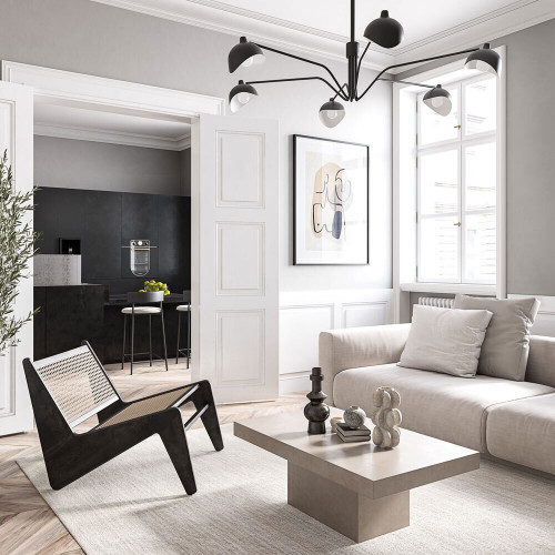
There comes a time in every homeowner’s decor journey when they long to hit the reset button on their home’s look, especially when the calendar turns over to a new year.
But instead of hopping on a new trend for 2024, why not consider one that has stood the test of time? Yup, we’re talking about the effortless yet cooly elegant decor style known as minimalism.
A minimalist approach, however, isn’t just about clearing away excess and paring back on side tables. Instead, this decor category leans hard on carefully curated pieces, a quiet color scheme, and lots of clean lines.
“Minimalist decor dedicates space only to the absolute essentials of interior design, reducing the elements of a home to what is both required and functional for the rooms,” adds Charlotte Granville, a home remodeling specialist with Fixr.
Ready to learn more? Check out the minimalist decor backstory and dive in with these savvy pro tips to bring the look into your home.
What is minimalism?
Much the way it sounds, minimalist decor is a no-frills style that’s simple in every way, from subtle texture to clean lines.
“It’s an aesthetic that offers a more serene atmosphere and fosters a sense of calm and tranquility that allows a home’s architecture to be center stage,” explains Lisa Davis, shopping expert at RetailMeNot.
Minimalism also appeals to our soul and inner need for calm, adds Davis, who reports that embracing a minimalist style means less “stuff” to contend with—which might lead to lower anxiety and depression.
“This decor style is more popular now as people have wanted to streamline their lives and alleviate stress as well as advocate for fewer resources and reduced waste,” says Davis.
When did minimalist decor start?


For the official history of minimalism in the home, look to Japan, says Pablo Solomon, an artist and designer.
“The roots of the look go back to Japanese Zen philosophy and design, which advocates a ‘less is more’ approach, much like a Zen garden,” Solomon explains.
Before adding anything to a room, every element must make sense and contribute to the goals of balance and harmony.
“Designers like Frank L. Wright took to heart the Japanese concept of balance of form and function in harmony with the natural setting,” he continues. “And then in the mid-20th century, Scandinavian designers continued the style with simple, practical minimalist furniture and accessories.”
Scandinavian designers are considered the benchmark for quality in minimalism, and their work was a major influence on midcentury modern design. If you love Scandinavian or Japandi decor, both are excellent patterns to follow for a minimalist decor scheme.
Start by decluttering


Functionality is the basis of minimalism in the home, which means you won’t easily install a clean and simple look with piles of products on your bathroom counter and junk mail clogging your bookcase.
Can’t face removing your own memories and assorted collections?
“You can hire a professional organizer to declutter your home for around $450,” notes Granville. This outlay might be money well spent if it’s hard for you to find the time for this project as well.
“Minimalism means everything has a purpose,” points out Davis. So if possible, get rid of things you don’t need or use anymore. This way, “your rooms will instantly feel more open and spacious,” she adds.
Stick with muted colors


Alas, if you’re a big fan of lots of bright shades together, the minimalist look probably won’t be your cup of tea.
When it comes to colors, “minimalism rooms are often monochromatic and neutral, which means blacks, whites, and grays,” says Davis. But don’t skew too dark in your palette.
“These muted hues allow for an inviting, calming atmosphere that’s light and airy, so use black as an accent color rather than the focal tone since it darkens a room rather quickly,” she says.
However, saturated colors can suit a minimalist home, says Cassie Hanson, founder and principal designer at the boutique firm Dae Planner.
“The key is restraint—choose one or two hues, and use them sparingly by highlighting a wall, putting in a statement piece, or with textiles or accessories,” Hanson explains.
Choose simple pieces

 Photo by John Maniscalco Architecture
Skip heavy, ornate chairs and tables, and skew toward furniture that’s on the plain side, say the experts.
Davis favors materials like wood, stone, concrete, and glass.
Hanson also suggests anything natural, from rattan to metal as long as “the shapes are clean and slender without bulky overscaling.”
Allow for some pattern and texture


Yes—you can use patterns in your minimalist home. But “find some that have negative space in them, and then intersperse them with solid colors and textures so the eye travels cleanly,” says Hanson.
For example, “try muted, neutral-toned patterns to break up the design in any room and bring some flair to your aesthetic,” adds Davis.
